Wednesday, 2 April 2014

Less familiar but much useful CSS properties

Using CSS is a routine drill for every web designer and developer. Oh, don't tell me you are a web designer and you don't worry about your CSS. Having read this post till the end, you will have an idea about these overlooked CSS properties. These properties can really optimize your style sheet, make your things done easy.

So, here it goes..

1. align-items 

Specifies alignment of content inside the container. 

And values you can use are:
  • stretch: contents is stretched to fit the container
  • center: content is centered to its container
  • flex-start: content at beginning of the container, starting from top-left.
  • flex-end: content at endof the container, starting from bottom-left.
  • baseline: content is placed at the baseline of the container.
 Supported in IE10+, Firefox, Chrome, Opera

2. backface-visibility

Determines the visibility of backside of the div

This is useful when you perform any transformation on the div like rotate, skew, etc.
CSS back-face visibility

 And values you can use are:


  • visible: Back-face is visible.
  • hidden: Back-face is not visible.
Supported in all major browsers.


2. caption-side

Position of a table's caption

I have seen people creating a row within a table just for putting a caption. Hey, you don't need to do that, when you can use caption-side, provided you are using <caption> tag.
And values you can use are:
  •  top: Caption at the top of the table.
  •  bottom: Caption at the bottom of the table.
Supported in all major browsers.


3. column-count

Divide the container in number of columns

Want to show newspaper like columned content? Column-count is pretty useful for you.
AVYCUA: (smart-work!)
  • number: Specify a number of columns to divide the container in.
  • auto: Automatically sets value according to the value of column-width
Supported in IE10+ and rest of the major browsers.


4. column-gap

Specify the gutter width between two columns.

Having used column-count, now you can specify the gutter or margin between columns. You can use column-rule to specify color and width of this gap.

AVYCUA:
  • length: Length in pixel to specify the gap.
  • normal:  Default length of 1em.
Supported in IE10+ and rest of the major browsers.


5. quotes

Specify the characters to be used as quotation mark.

Did you know, you can use any character as a quotation mark? For example, you can write
«French Quotes» instead of usual "French Quotes". For that you have to use HTML's <q> tag for quotes. This is how you write in CSS:
q
{
quotes: "«" "»";
}

 You can specify four values for this property as,

 quotes: "«" "»" """ """;

Don't get confused by the Braille in the end.The first two values within " " are for outer quotes and next two values specify character for inner quotes. So above string would look like this now:
 «"French" Quotes»

Supported in all major browsers.

 There are more properties than these five which are less used, but the reason I haven't add those here is either those are deprecated or major browsers do not  support.

Enjoy designing!

Saturday, 29 March 2014

7 Free gorgeous hand-drawn icon sets for you


Hand drawn like icons are very gorgeous and they look sporty if you have something enthusiastic and lively niche of your website. Here are my picks, which I would definitely want you to use.

Hand drawn icons from Freepic


Hand drawn social media icons

hand drawn social media icons


49 hand-drawing icons set


Brainy Icons - educational and science icon pack

Brainy - free educational and sciece icon pack

Hand drawn vector icons

Hand drawn vector icons

Free set of 28 hand drawn icons

28 free hand drawn icons

Icons by dryicons.com

Hand drawn icons by dryicons


Please take care of copyrights of these works while you make use of them. Almost all of them are free, and that's why I've listed them, but still, obey and enjoy.


Wednesday, 19 March 2014

Decent images on deviantART for your website

A UI designer like me, is always looking for something which not only defines their niche, but expresses it thoughtfully. And you know, images do this for you much effectively.

 deviantART is a powerhouse for every designer. You get variety of purposeful, wholeheartedly crafted artworks from tons of artists. Many of them are free to use too! I'm listing out some decent artworks, you may consider adding into your project.

1. Blur


UI Hints: Decent images on deviantART for your website 

2. Carbon Grill

UI Design hints: Decent images on deviantART for your website

3.MonkeyMagicos Dark Wood

UI Design hints: Decent images on deviantART for your website  

4. Perforated Chromatec

UI Design hints: Decent images on deviantART for your website


5. PXL

UI Design hints: Decent images on deviantART for your website


 I'll be updating this frequently...

Wednesday, 12 March 2014

Awesome Text Flip Effect using jQuery

This idea popped up in my brains, when I saw a digital ad board in Deccan side chowk in Pune. The ad displayed on it was sporting some cool text, which would animatedly flip its each character to a new character, forming a new cool text.

So that thing in my mind, I have tried to imitate  that in some sense on my client's homepage. But little bit differently.
Check out this fiddle to see it live.
It is amazingly easy using jQuery. Simply styled wiith CSS.

How to do a text flip?

Create a <p> element inside a <div> with following code.

    <div class="textflip">
        <p></p>
    </div>


In .textflip we have a paragraph element, where we are going to append a line or a string which will be flipped. The following script is self explanatory, which gets single character out of a string, and replaces with a single character of another string.

     /************************************
   Create two strings manually, with same lenghts.
   *************************************/
   var str = "0110 1101 1111 0100111";
   var str2 ="Live life king size...";


    /***********************************************
       Loop through each character. 

       Append that character as a <span> to
       <p> in our '.textflip' which is a container.
    ************************************************/ 

    for(var i=0; i<str.length; i++)
    {
      $('.textflip p').append('<span>'+str[i]+'</span>');
     }
      
     
    var halt = 75; // Animation speed
    var j=0;

   
    //Count the number of spans i.e chars in string
    var count = $('.textflip p').children('span').length;

    anim(); // Call animation function


    /************************************
     Animation function
    *************************************/  

    function anim()
    {      
       var n=j;
       $('.textflip p > span').eq(n).animate({
            opacity:0 //By putting opacity zero, vanish the character.
        },halt,function(){
            //This is what to do when character is vanished
            //Bring in the char from second string, display it by opacity:1
            $('.textflip p > span').eq(n).text(str2[n]).css('opacity',1);
                     if(j<=str.length)
                     {
                         anim(); //Animate jth char until j is not an end char.
                                  
                      }
                                   
              });
                                   
               j++;  //next character please!


       }// end of anim() 


Here, anim() is a recursive function which will run unless all characters are not flipped (replaced, actually).

Drawback here is, string length is known. What to do if length is variable? Will you help me to frame the logic for 'dynamic text flip'?

Monday, 24 February 2014

Nokia X : Nokia's First Android Phone's Review

Nokia X
Unveiled at Barcelona Mobile World Congress, the new Nokia X is a new guy in the town, with Hybrid platform. Initially it is said that, Nokia X will run on the Android platform, which is true, but the interface is not at all alike other Android phones in the market. It has been given a typical 'Nokia Lumia'ish essence, if you search around a bit.

So I put only those features in front of you, which most of the non-techies are interested in. I just won't go into detailed specs.

Display:

4.0 inches.
480 x 800 pixels.
Display quality doesn't look as good as we expect.
Home button works as back button too.

Sound:

As usual, supports Mp3, WAV.

Memory:

Processor memory: 512 RAM.
Internal memory: 4GB
Expandable upto 32 GB.
1 GHz Dual Core CPU

Camera:

3.15 mega pixels.

Operating system:

Android 4.1

Sensors:

Proximity, Accelerometer.

Battery Life:

400 hours, if you just keep staring at the phone. Just. Staring. Yes, I mean standby mode.
13 hours of talk time.
25 hours of music play.

Price:

It is said 80 euros. In The India it will be around Rs. 7000 approx. Seven Thousand, isn't it affordable? Nokia plus Android, hell, it IS affordable.

Nokia is beloved in The India anyway (God forbid, you forgot 3315?), now it is coming up all riding on later most admired Android. So that's gonna be a party pack, in my opinion. if you were thinking about Nokia Asha, this is one more choice you've got. I am positive about Nokia X.


Sunday, 23 February 2014

Metro UI Recipe: What Microsoft has used in its Metro UI

Seriously, buying Lumia over an Android was a result of curiosity about Metro UI by Microsoft. And I remember, I wasn't asleep till 3 a.m, and was tracking down each and every single piece of Lumia's features.  So, today I elaborate in my terms, why that interface is handsome! Meanwhile you can check out which apps are crafted best with this UI.

1.Font

Most prominent font Metro UI has adopted is font named "Segoe UI" on the desktop OS, and "Segoe-WP" on the mobiles. Microsoft designers have powerfully structured the typography of Metro UI with this font. Have a look at this image. Isn't the way the word "people" is displayed, just awesome? How professional that font and its size sums up on a whole screen!


 2. High Contrast

 The beauty of font used is glorified by the contrast background. And the white space canvassed is like a big big playground.

3. Icons


 In my opinion, icons those Metro UI has used are as good as other frameworks. No big deal. But well played UX guys. Primary actions are defined well by icons. On the phones, secondary actions appear when that three dots (...) icon is touched. So all in all, UX is specially taken care of. It is also being said that, the numbers in squares you find in any list, are inspired from Swiss currier company's numbering style on their packages.

4. Swipe


There is much discussion on the internet, that swipe UI will not save Windows and all stuff like that. I really don't think so. See, this is something different than other UI available in the market now. Yes there are many many classy applications which are the 'players' in swipe. But a cute trick here is, 90-10 view of navigable menus. You can  see a little glimpse of next menu item's title on the current screen you are working on.

Swipe UI in Nokia Lumia
Indicating the next navigation items in queue.


Swipe UI in Nokia Lumia
Indicating the next piece of content in the queue.


These are the four iconic pieces of whole Metro UI. Have I missed on anything? Comment below for that, yeah and apologies if anything is actually left out. So, get a "Segoe UI" font, put it on a contrast backdrop, with extra readable font size, decorate it along with some cute icons, use full power of Swipe UI, and your Windows Phone app is ready to show off. Nah, kidding. It takes much more than just this.

I'll come up in my next post, why Metro UI has not been a savoir for Microsoft, in spite off such a hard work implied.

Wednesday, 19 February 2014

Useful Utilities For Web Design & Development

Here is a list of much much useful utilities for a web developer and designer, that makes their work smarter.

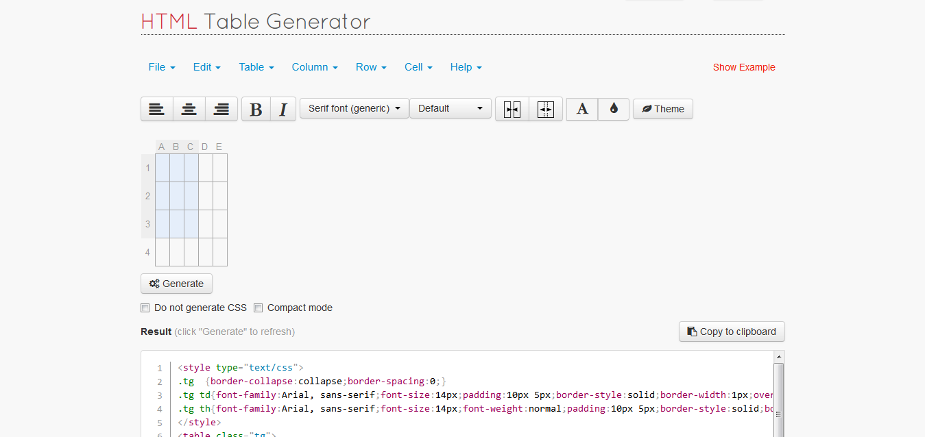
1. HTML Table Generator

HTML Table Generator

Very useful tool for people who are not familiar to HTML and CSS. You can easily get the HTML code as well as CSS for the table. You can specify rows, columns, widths, cell spacing, fonts, etc. This site also provides themes for your tables.

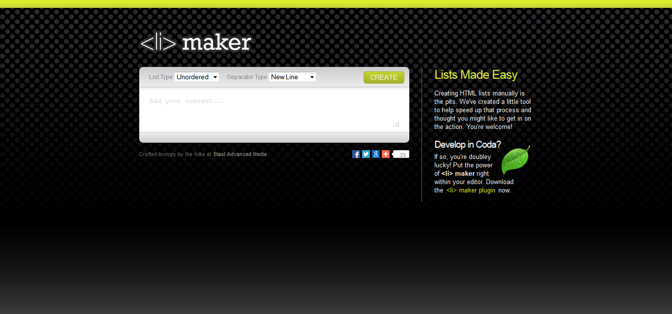
2. <li> maker

<li> maker

Its name says it all what it does. Generates  a HTML code of <ul> <li>...</li></ul>. Most beautiful thing about this is you can copy and paste even a list in your word document, and this will generate a HTML code for that.

3.Form Builder For Bootstrap

Form Builder For Bootstrap

Designers know what Bootstrap is. This site creates a form with Bootstrap classes by just dragging and dropping form elements. For developers who are less familiar about Bootstrap's classes may find it as a useful tool.

4. CSS Triangle Generator

CSS Triangle Generator
CSS Triangle generator creates a CSS code by great WYSIWYG tool. For designers it should minimize their efforts behind coding these little buggers.

5. Responsinator

Responsinator - Tool for responsive design testing
Superb responsiveness testing tool, for designers. You can check your design on almost of all size devices given here.
Did you know, you can ctrl+shift+m in Firefox now, for RWD testing?

CSS: Simple top and bottom margin hack.

Most of the web designers use very brilliant frameworks for setting up the UI, like Bootstrap, Foundation, etc. These frameworks save your great time, no doubt. Few days ago, working with Bootstrap, I observed that, though it has smart fluid grid, sometimes you have to set an element to an unusual position. You may want to leave a little top or bottom margin to a div, for example.

Bootstrap comes up with an offset option, which allows you to set the position of an element by few left or right margins. But by top and bottom margin? Nope! Bootstrap doesn't give you anything for top and bottom margins. Obviously, it is not much important when your elements are getting stacked nicely.

So, within few free minutes of my so-called "relaxing" web design work schedule (which my boss thinks I  have), I wrote a CSS, which you may find stupid, which includes 200 classes. Hundred for margin-top:0 to margin-top:100px, and same for margin-bottom

Sample Code

@charset "utf-8";
/* CSS Docu.ment */
.margintop1{margin-top:1px;}
.margintop2{margin-top:2px;}
.margintop3{margin-top:3px;}
.margintop4{margin-top:4px;}
.margintop5{margin-top:5px;}
.margintop6{margin-top:6px;}
.margintop7{margin-top:7px;}
.margintop8{margin-top:8px;}
.margintop9{margin-top:9px;}
.margintop10{margin-top:10px;}

 
Yes, you can see how stupid that is to write some line 200 times. But later this helped me, as I went on calling these classes into my templates, so that I don't need to write individual margin property in respective CSS.

Download margin.css

Tuesday, 18 February 2014

Top 5 Best designed apps on Windows Phone 8

I was a loyal Android user till the day before I purchased my Nokia Lumia 520, with WP8 on it. (I still admire Android, but not over WP8!) Before buying, I made heck of R&D online about WP8. I am a huge fan of flat and minimal UI. That has what appealed to me in Windows Phone. As I started exploring the app store I found both interesting and crappy apps. So I have listed out following apps, which have awesome designs, and they do justify the overall Windows Phone experience.

Network Speed Test allows you to check your current internet connection speed. The logo is simple and conveys what this app does. In ­app experience is good; it shows connection speed on a radial gauge which is pleasant to look at.


4. Pintrest Lite
Pintrest Lite
Most of the list-it-up freaks know what Pintrest is. This is similar to official Pinterest Android or iPhone app on WP store, but the overall UI is nice.


3. Day Counter
Day Counter
This is the most customizable day counter app on WP store. Day Counter categorizes the time since you've done something, has a countdown for what you are set to do, and tells the streaks of things you've already done! All this is beautifully fit on a single screen which tells your progress at a glance.


2. Insider 
Insider
This is a must­have app for Windows Phone users. Insider allows you to check battery stats, change your locked­screen image to the current Bing picture of the day, and tile the shortcuts for phone settings (this isn’t otherwise doable). These features are arranged so professionally that you feel awesome about using a cool gadget.


1. Breez 
Breez
This app is mind­blowing. If you are looking for a weather app, download this 1Mb piece of beauty. It is worth more than any other weather app out there. After that? Pinch, swipe, scroll. I am in love with this.


There are lots more than these listed above. But as Windows Phone is bit lagging behind Android and iPhone platforms, the variety of apps is little narrow. But this flat and Metro UI by Windows, has given a new dimension to the user interfaces of the apps. It has a bright future ahead, IMO. What do you think?

Also Read